TAKASIMA Corporate Identity
Client
TAKASIMA
Year
2020
Sectors
Health and Wellness
Services
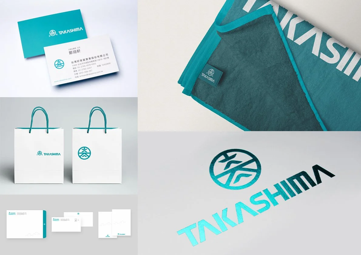
Corporate Identity
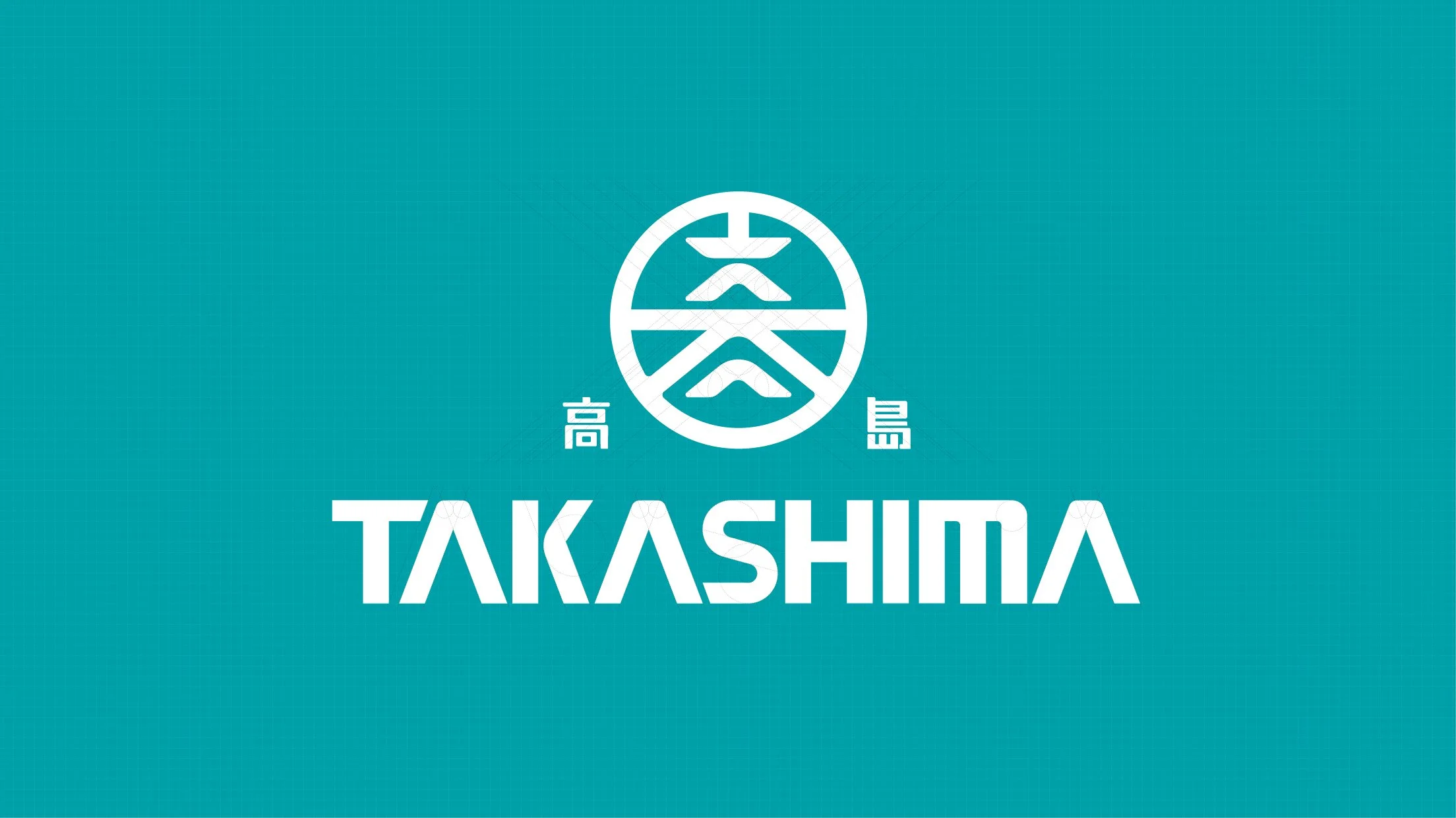
TAKASIMA|The Japanese Spirit That Endures Time
In Japan, what truly withstands the passage of time is not decorative form, but a composed and resilient spirit.
As TAKASIMA stepped toward its next thirty years, the brand chose to return to the origin of Japanese aesthetics. From the structural rhythm of century old wooden architecture, the rise and fall of shrine rooftops, and the layered tiles of ancient castles, to the extreme restraint, proportion, and use of negative space found in family crests, TAKASIMA rediscovered a core belief. Excellence reveals itself through restraint, and eternity lives within detail.
The new brand mark was born from this conviction.
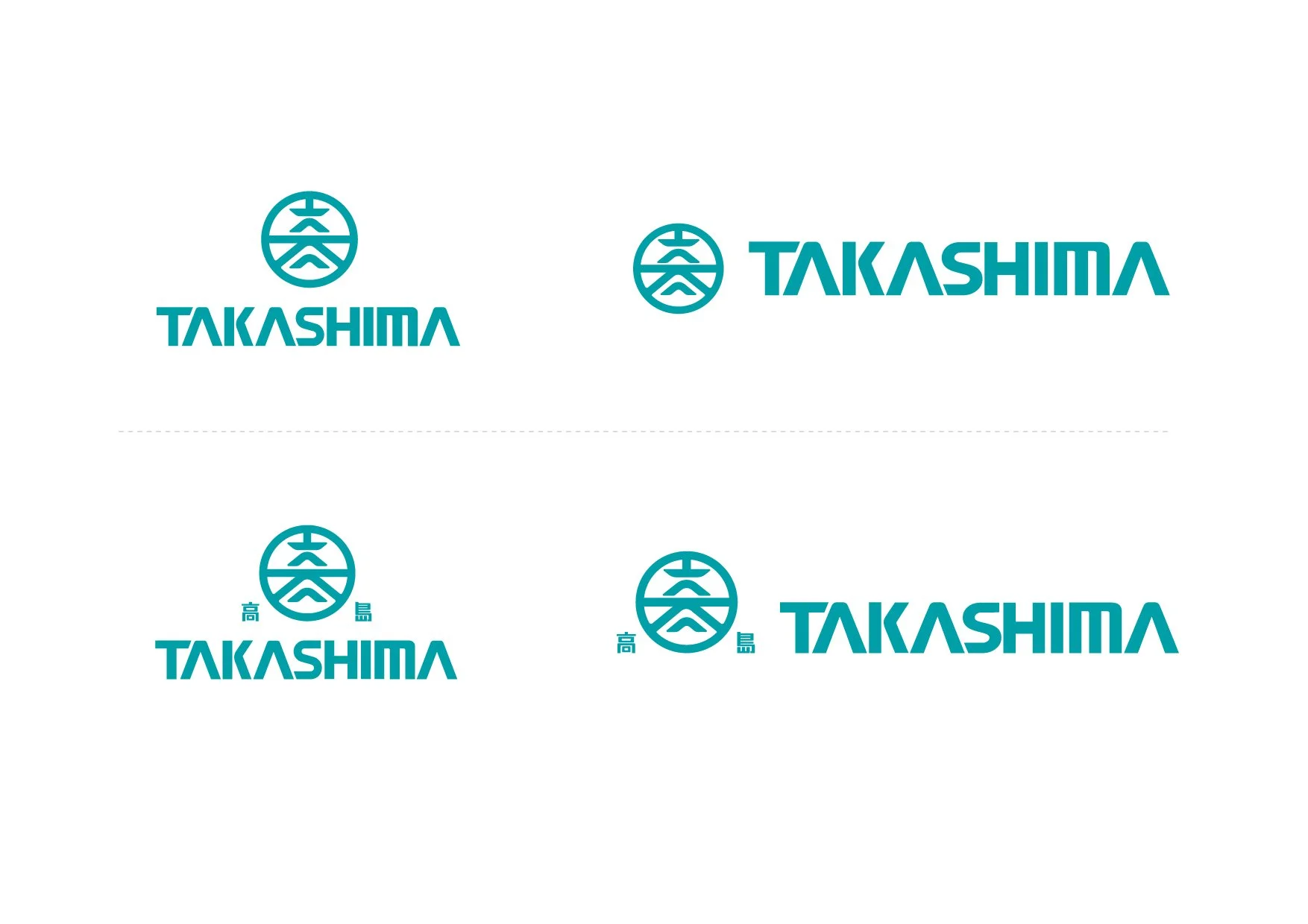
From Family Crest to Phonetics|The Symbolic Language of TAKA
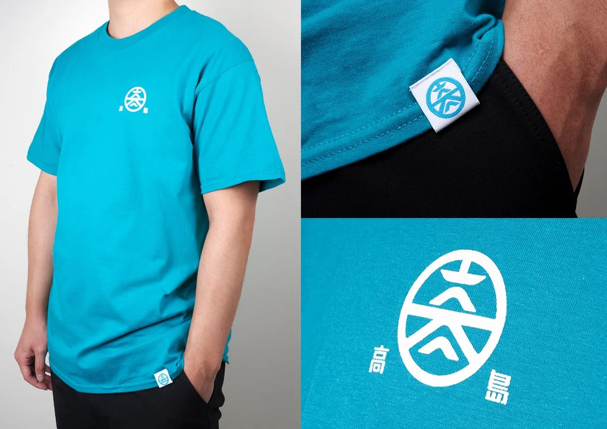
The core concept of the mark originates from the Japanese pronunciation of the character meaning height. TAKA. The first syllable of the brand name was transformed into the spiritual axis of the entire visual system, allowing sound, symbol, and structure to exist within a single lineage.
The circular frame of the family crest represents restraint and purity. It becomes a cultural stage that holds the brand’s spirit. Within it, geometric lines draw from the structural language of ancient architecture. The center of gravity of rooftops, the span of beams, and the layered rhythm of fortification all inform the design. Through precise vertical division and horizontal tension, TAKA is abstracted into a visual form.
This is not a reproduction of tradition. It is the fusion of phonetics, architecture, and brand name into a new symbolic language designed for long term evolution.
Within this structure, horizontal lines represent a stable foundation. Three ascending forms echo the name TAKASIMA and symbolize thirty years of progress, elevation, and perseverance. The negative space established by the frame gives the mark a timeless elegance rooted in the logic of a family crest.
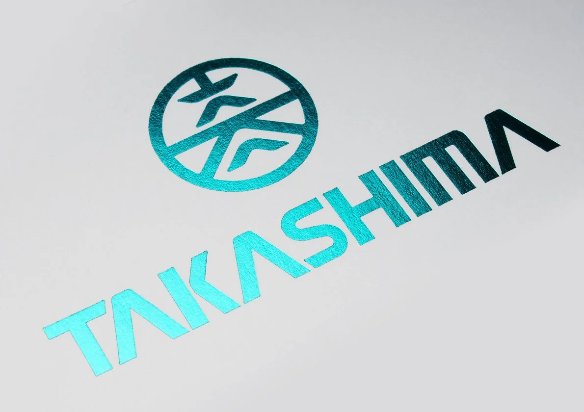
Typography|A Modern Echo of Showa Industrial Aesthetics
The new TAKASIMA typeface continues the spirit of the mark. It draws inspiration from the angles, proportions, and rhythmic lines of the Showa era’s industrial design.
It recalls the quiet cadence of lattice windows in Kyoto townhouses and the structural distribution of beams in Himeji Castle. Persistent, grounded, and precise, the type expresses strength through restraint.
Typography and symbol are not treated as separate elements. Together, they form a unified brand language. Name and mark support one another in structure, spirit, and purpose.
Toward the Next Enduring Thirty Years
For TAKASIMA, sustainability does not mean chasing trends. It means preserving the soul of craftsmanship while allowing aesthetics to continue evolving.
Japanese excellence at its highest level, combined with a century of cultural inheritance, is not a slogan. It is an attitude.
The brand is reshaped through rigorous aesthetics.Culture is carried forward through restrained lines.And through pure symbolism, TAKASIMA speaks to the world.
With a new generation of Japanese aesthetic language, TAKASIMA moves toward a future that is more refined and more enduring.
This is the Japanese spirit of TAKASIMA.And a classic created for the future.