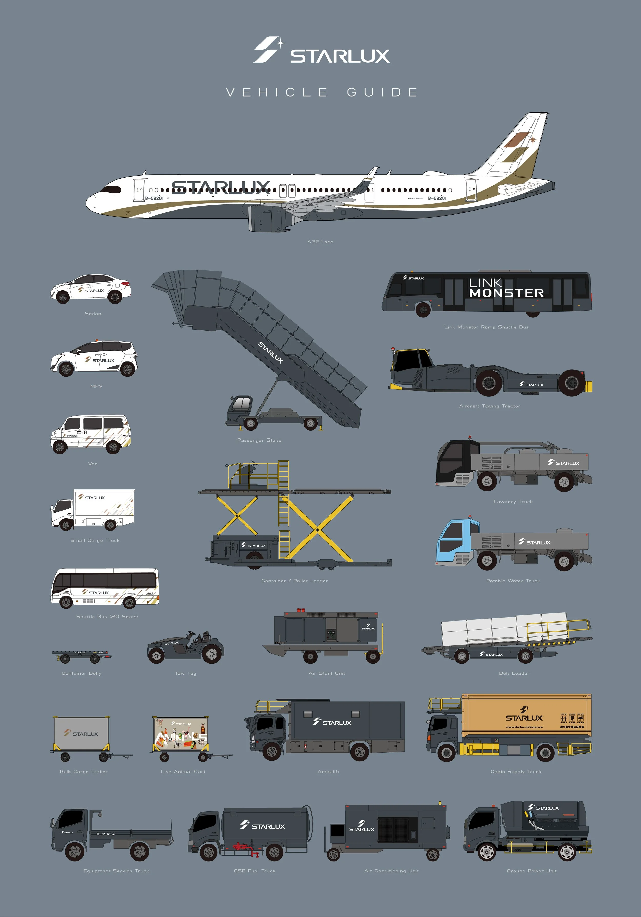
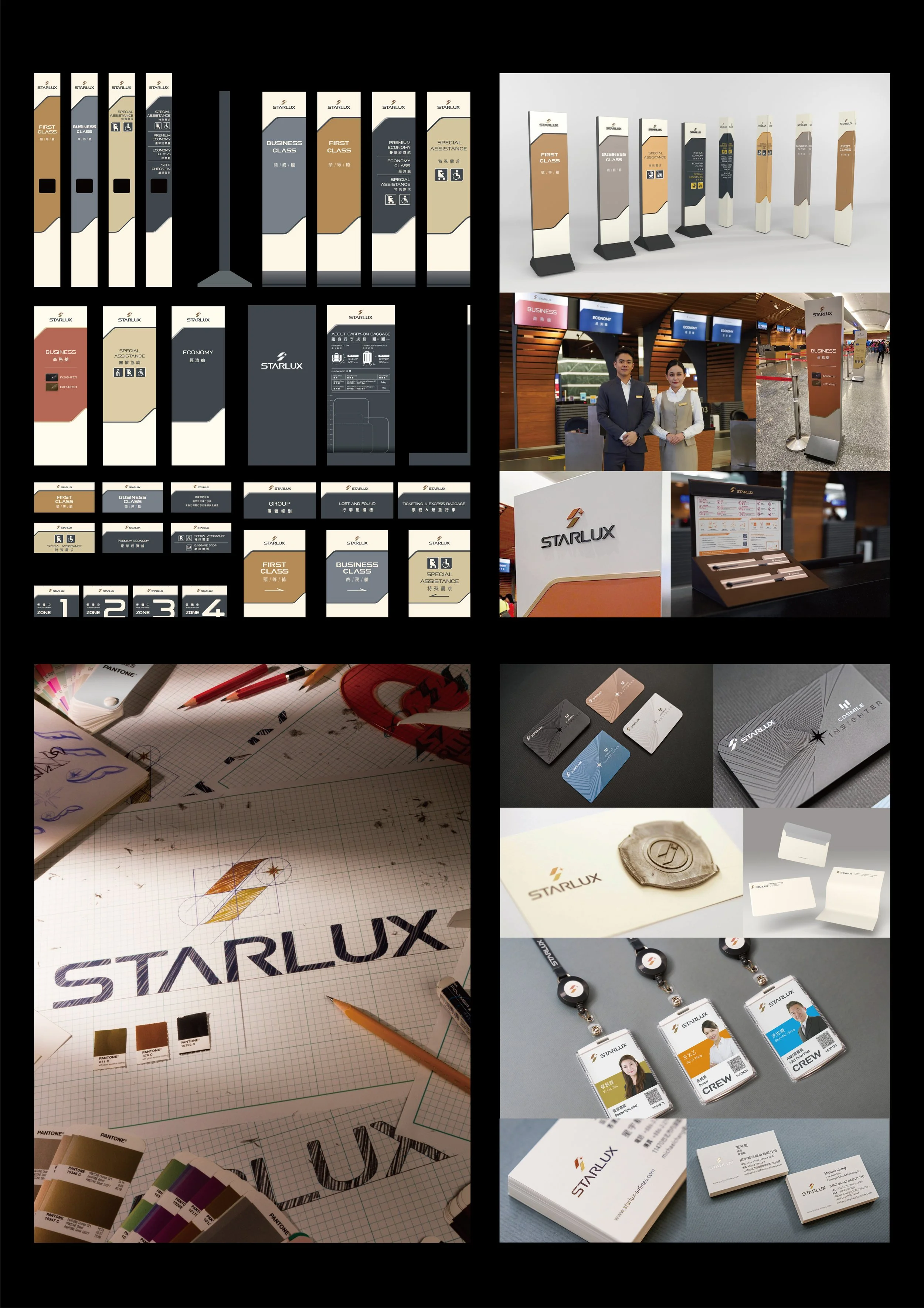
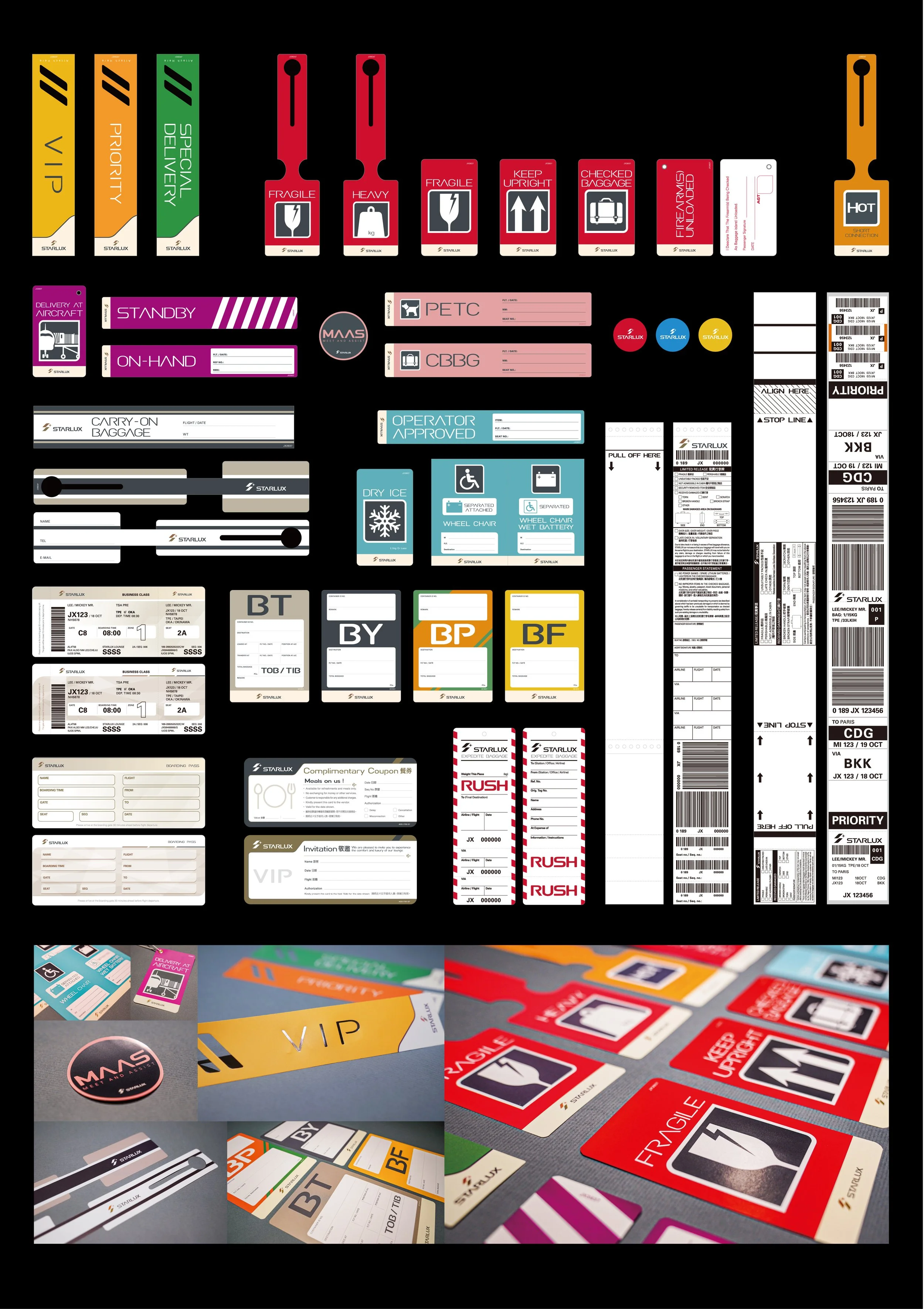
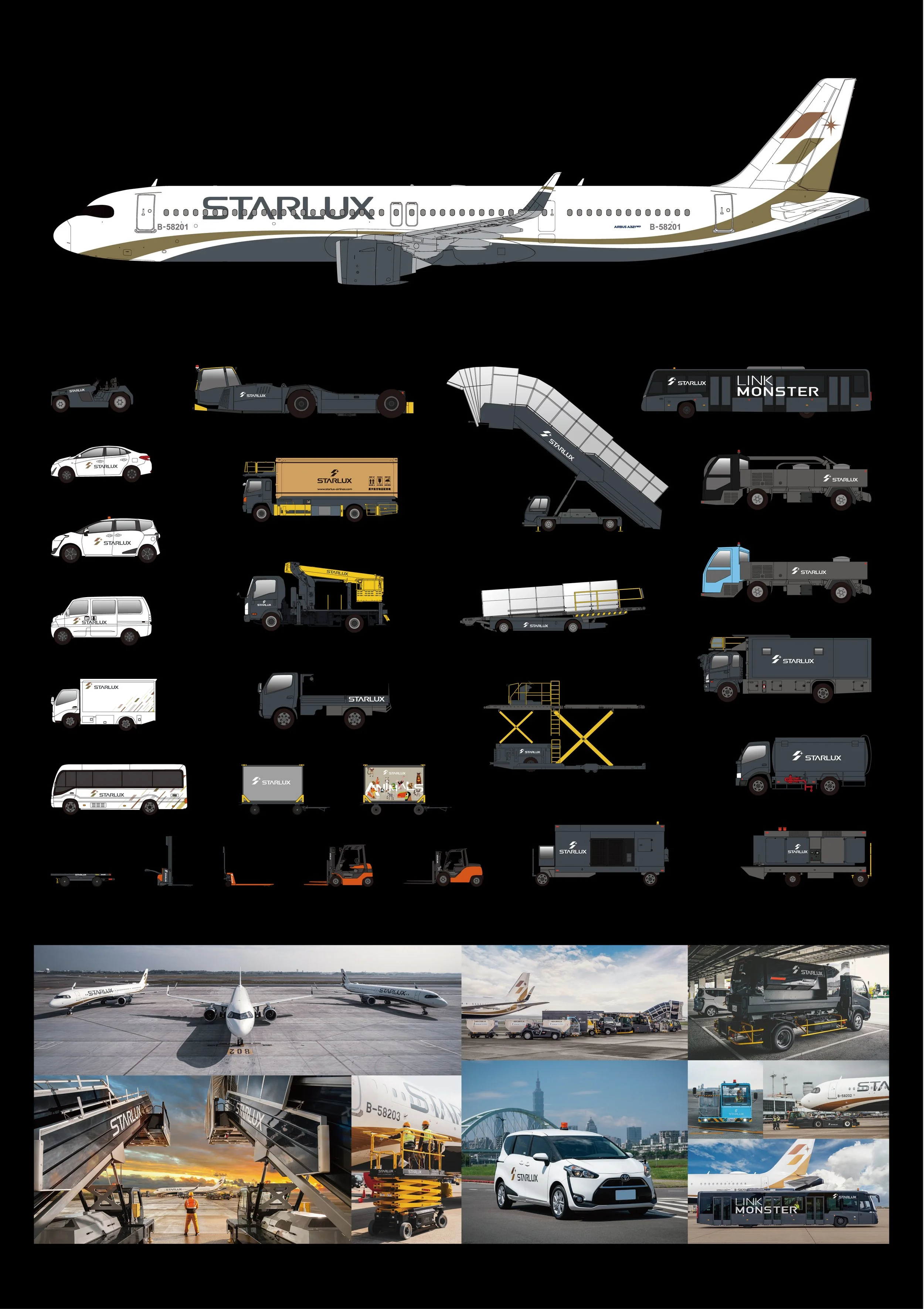
STARLUX Airlines Corporate Identity/ Aircraft Livery
Client
STARLUX Airlines
Year
2018
Sectors
Aviation Services
Services
Corporate Identity
/ Aircraft Livery
-
Creative Director: Xi-Shan, Chuang
Chief Operating Officer: Pei-Chun, Chang
Marketing Planning Director: Jia-Wen, Zhao
Art Director: Hsuan, Chen
Designer: Yu-Cheng, Hung
Assistant Designer: Yu-Hsiang, Chang
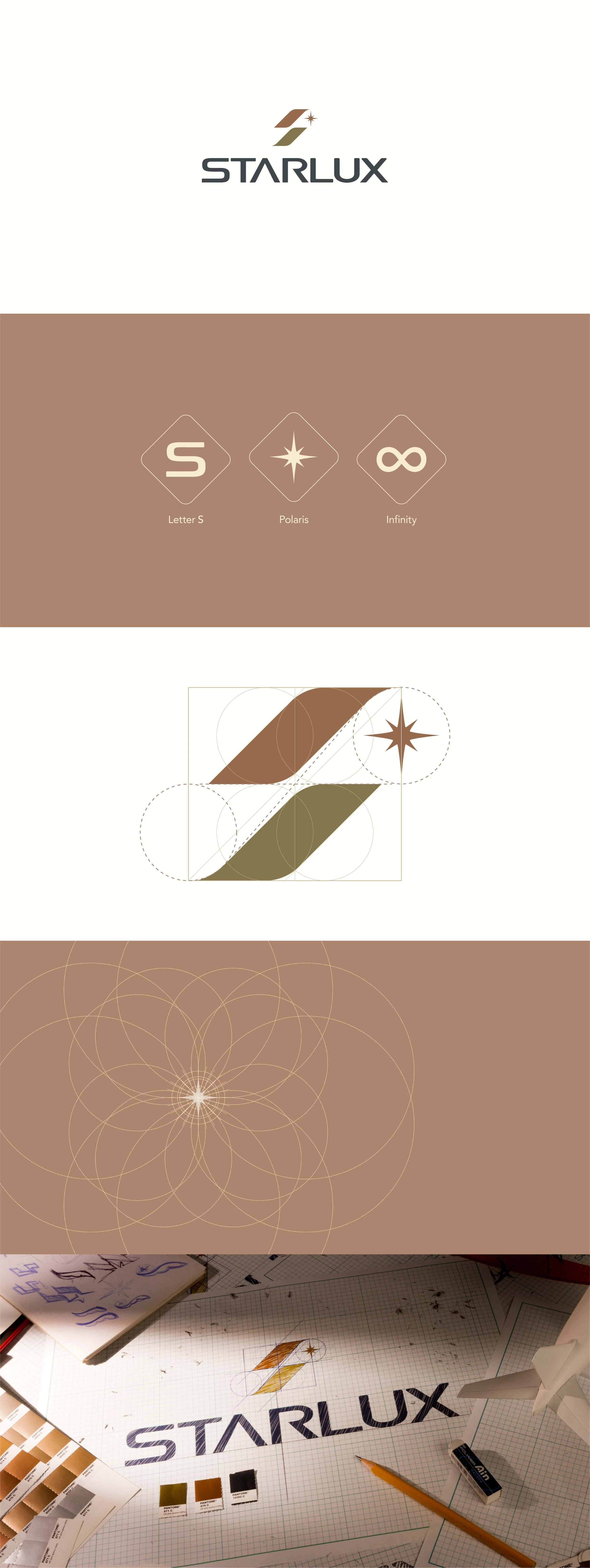
Within STARLUX’s brand language, curves have always been the most captivating form. From the very beginning of the visual identity, curvature became the brand’s unique soul. It is an extension of the letter “S”, the trajectory of flight routes, and the posture of flying itself.
To ensure that every STARLUX aircraft shares a consistent and elegant visual proportion, regardless of aircraft type, including A321, A330, A350, and future models, a flowing curve rendered in Earth Gold was applied across the fleet. The line is both minimal and refined, resembling the force of an aircraft lifting into the air. It guides passengers smoothly through the sky while leaving behind STARLUX’s distinctive arc of flight.
The aircraft belly is finished in Obsidian Gray, bringing visual balance and clarity to the overall composition. Deep yet not heavy, restrained yet unmistakably present, this tone creates a premium contrast against Earth Gold. Together, the colors give the aircraft a layered quality that feels closer to a crafted object than a machine.
These lines and colors are not decorative elements. They are a direct continuation of STARLUX’s brand spirit. The curve of the “S” defines the posture of flight. Earth Gold and Obsidian Gray articulate STARLUX’s aesthetic language. Every arc formed in the air becomes an extension of the brand’s original intention and refined taste.